Senior Connections: A New Brand, A Renewed Spirit and a Stronger Connection to the Community
A Proud Mission Hidden Behind an Outdated Brand
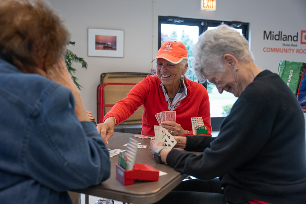
For nearly half a century, the Boone County Council on Aging (BCCA) has served as a trusted lifeline for older adults and caregivers in Belvidere and Boone County. The organization was providing transportation, social activities, Medicare and Social Security guidance, in-home support and companionship long before “aging services” was a formal field.
Yet, despite its proud legacy, its public identity had grown outdated and unclear. BCCA made a deep and ongoing impact for thousands of clients, but its brand no longer lived up to its promise or reflected the professionalism of its people.
Leadership recognized the need for a modernized identity—one that honored its mission while renewing relevance for new generations of seniors, families, caregivers, donors and community partners.
BCCA turned to GrahamSpencer.
Defining Success: What the Rebrand Needed to Deliver
Having won the assignment, GrahamSpencer quickly established multi-dimensional project goals:
- Reconnect BCCA with longtime clients and caregivers who valued the organization but felt detached from its stale identity.
- Attract a new generation of seniors and caregivers unfamiliar with BCCA despite its high-quality care and client-friendly experience.
- Support staff and volunteers with a vibrant identity and modern tools matching the professionalism of their services.
- Strengthen donor confidence and community partnerships through a clearer, more contemporary organizational story.
What We Learned From Those Who Knew BCCA Best
GrahamSpencer deployed our proprietary GSearch blend of qualitative and quantitative research – focus groups, stakeholder interviews, market analysis, competitive brand audits and strategic planning – to identify the most relevant and ownable position for BCCA. Our qualitative work placed a premium on attentive, respectful listening — especially to seniors who often feel spoken for rather than heard. By approaching every conversation with neutrality, courtesy and curiosity, we surfaced truths the organization had long intuited but never articulated.
Across sessions with staff, board members, volunteers, riders, caregivers and community partners, several key truths emerged. Our team’s own age diversity — including veterans of the industry, mid-career team members and younger creatives — helped us interpret these insights without bias or condescension, grounded in a shared belief that aging is not decline.
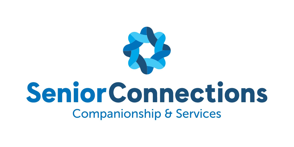
Senior Connections: A Human Name Rooted in the Client’s Mission
Although a name change was not specified in the original RFP, GSearch strongly suggested it was essential. BCCA’s CEO and Board quickly supported expanding the scope of work. Importantly, the robust naming validation research process wasn’t linear; several internal favorites did not advance. We understand the audience, but we don’t mistake ourselves for them — their feedback, not our preferences, guided the final selection.
“Senior Connections” emerged directly from research findings. Warm, human and confidence-inspiring, the new name shifts the organization from a confusing label that suggested a bureaucracy to a welcoming invitation. “Senior Connections” instantly communicates values and value the organization has long stood for.
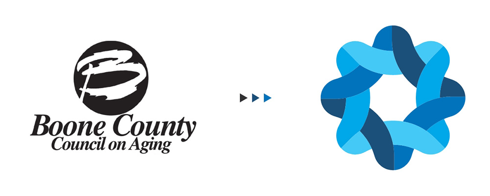
A New Logo Inspired by Connection, Continuity and Care
GS created a new logo inspired by the Celtic knot, a centuries-old symbol of interconnectedness, continuity and enduring support.
Modernized through contemporary design, the mark—and the strategic messaging it supports—communicate many values:
- Unbroken connection
- Strength through relationships and community
- The interwoven support systems that keep seniors independent
- A bridge linking seniors and their families to vital community resources
Senior Connections’ core truth—connection as dignity, connection as independence, connection as community—has become the strategic foundation for the organization’s next chapter.
A New, More Empathetic Digital Experience
GrahamSpencer designed and developed an entirely new digital home for Senior Connections. As a dynamic team led by seasoned creatives, we carry insights directly from discovery through design and development — the same people listening in research are the ones shaping UX, writing copy, refining photography direction and building the final product. Nothing was siloed; every touchpoint reflected the same commitment to clarity, dignity and accessibility uncovered through research.
- Accessible—with WCAG-aligned type, contrast and layout
- Responsive—mobile-first and intuitive, it functions equally well on all major browsers and device platforms
- Empathetic—clear and calming, it is designed for seniors and caregivers under stress
- Consistent—the site is visually aligned with the new brand identity

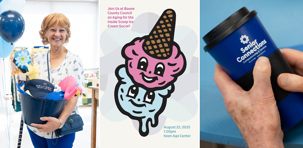
Launching the New Identity With Joy and Community
To introduce the new brand, GS helped Senior Connections staff execute its creative idea of hosting a mid-summer ice cream social and ribbon cutting event. And the Inside Scoop was born; a celebratory, family-friendly celebration featured blueberry and strawberry ice cream and a festive atmosphere that was the perfect way to introduce the new identity to an audience that some would assume would be change-averse.
The event elegantly served three purposes:
- Honor the organization’s legacy. Speakers included present and past leaders.
- Reveal the new name, identity and mission
- Re-engage clients, families, donors and the broader community
With more than 200 attendees, the Inside Scoop was a remarkably joyful expression of what Senior Connections stands for: bringing people together. Hat tip to Senior Connections’ leaders for this wonderful idea!
Impact: Renewed Pride, Higher Engagement and a Stronger Future
Senior Connections’ new brand reflects what its board, leaders, staff and volunteers deliver every day: a warm, welcoming, interconnected network that helps older adults live independently, joyfully and with dignity. Staff pride is renewed. Engagement is increasing and Senior Connections’ community profile is on the rise.
For GrahamSpencer, the project validates our core belief that when truth-seeking research meets skillful storytelling and design, brands become more than symbols. They become bridges.
Senior Connections stands confidently on that bridge—connecting seniors, families, caregivers and community partners with the support they need, when they need it most.
We partnered with GrahamSpencer to rebrand our nonprofit serving older adults, and the results have been exceptional. Their GSearch process delivered a mission-focused name and logo, a strong launch campaign and a modern, accessible website. Their blend of strategy, creativity and collaboration made the process seamless. We’re thrilled with our refreshed identity and highly recommend GS to anyone wishing to elevate their brand.
Kelly Hillan, Executive Director, Senior Connections
If your organization is ready to create brand infrastructure capable of carrying meaning for decades, we would welcome a conversation.
"*" indicates required fields