Chicago’s North Shore Convention & Visitors Bureau: Brand Identity
Back in 2008, GrahamSpencer was engaged to create a brand identity for Chicago’s North Shore Convention & Visitors Bureau, which represents a bevy of well-known suburbs to the immediate north of the Windy City. At the time, Chicago’s North Shore’s leadership wanted the identity to tell a story of the region’s proximity to Lake Michigan, the Great Lake that defines Chicago’s – and the North Shore’s – cityscapes. The resulting wave graphic quickly became recognizable to travelers and industry insiders, alike. In 2018, however, CNSCVB came to the conclusion that the limited access visitors actually have to Lake Michigan in the North Shore suburbs (there are very few public beaches) had created a situation in which the identity, which they still loved, was making a promise that the bureau could not adequately fulfill.
Leaders contacted GrahamSpencer and asked us to help them create a new, dryer brand identity. First up was our GSearch qualitative research process to help redefine what the brand should stand for in the absence of water, as well as to make a variety of other strategic recommendations.
The resulting GSearch report suggested repositioning of the region mirrored by a new tagline: “City Life, Elevated.” The tag is an oblique but highly accurate double entendre that refers both to the high quality of visitor experiences available to Chicago’s North Shore visitors as well as the fact the region is conveniently accessible from Chicago by its famous “L” trains (elevated trains).
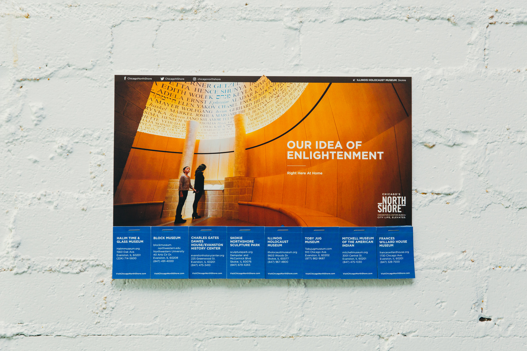
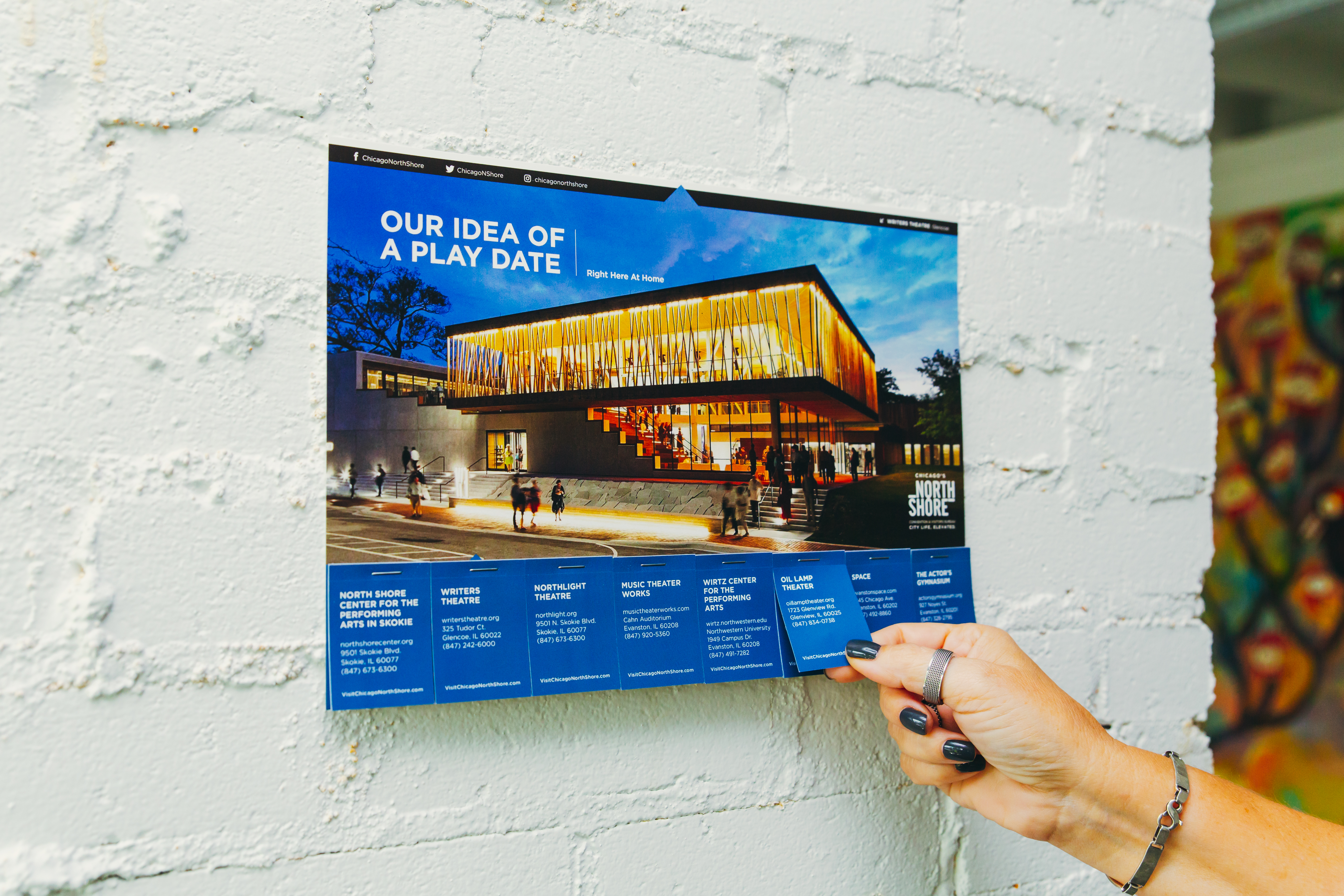
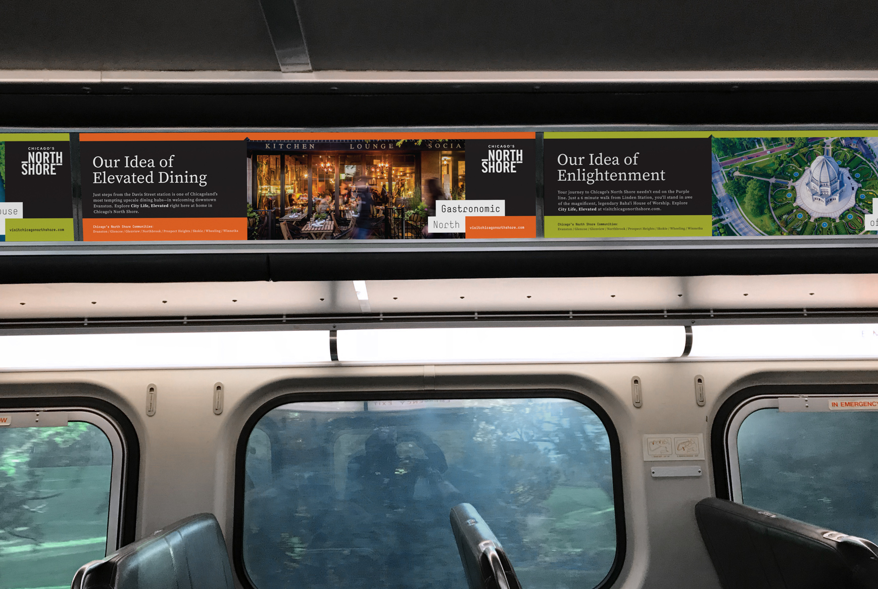
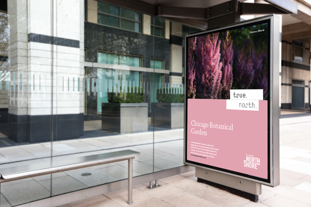
Just introduced in summer, 2018, the initial brand launch included digital advertising as well as transit advertising on the very trains the brand tagline evokes, as well as GrahamSpencer’s unique take on an old college cafeteria favorite: a series of “pull tab” posters that gave visitors an opportunity to choose contact information from intriguing places to visit.
