New Blood: Straight From the Heart
In 2008, the Rock River Valley Blood Center chose GrahamSpencer to help it research, plan and design a new brand identity, website and advertising deliverables. At the time, RRVBC’s brand identity depicted a giant drop of blood hovering over what one could only assume was a river of blood. RRVBC’s advertising seemed almost shrill in its urgent directives that new donors help reverse declining donation rates. Interestingly, the current advertising directly contradicted the research-driven communications strategy – delivered by the same national firm.
GS launched our reliable GSearch process and conducted in-depth local primary research, including one-on-one interviews, focus groups and telephone surveys with key stakeholders. Secondary research consisted of data mining (including that of the American Blood Center’s voluminous research), competitive brand audits and more.
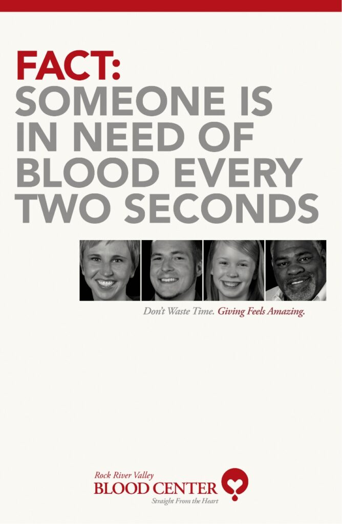
Our research revealed a number of serious challenges faced by Rock River Valley Blood Center. For instance, those who donated blood just once a year defected at a 57% rate, while those giving two or more times a year only defected at a 17% rate. Declining donations corresponded with a society that was becoming less community-minded as people felt less responsibility to care for one another. Also, increasingly stricter blood safety guidelines limited the potential donor pool. All these things contributed to a dramatically reduced blood supply – for which there was increasing competition among a growing number of collection agencies. Finally, research revealed that while RRVBC was respected by those who knew it, it had low brand recognition among the public.
GrahamSpencer’s new branding and communications strategy recommended increasing desperately needed donations mostly from existing donors due to the sky-high “defection” rate among new donors. Rather than “guilt” donors into taking action with shrill directives, we suggested playing to donors’ sense of caring and the “warm glow of philanthropy” that motivates such caring people.
Our simple storytelling strategy put the donor at the literal heart of the process: not the hospitals RRVBC served, employees, or recipients (who are second most important in the communications hierarchy). The donors mattered most in our brand strategy and guidelines.
The creative centerpiece of the new strategy was a beautiful new logo that ignited an emotional response and effectively communicated the organization’s mission. The chosen design (one of our favorites over decades in business) featured an iconic representation of a donor’s arms embracing a heart, symbolizing the close-knit community of giving fostered by the Northern Illinois Blood Center.
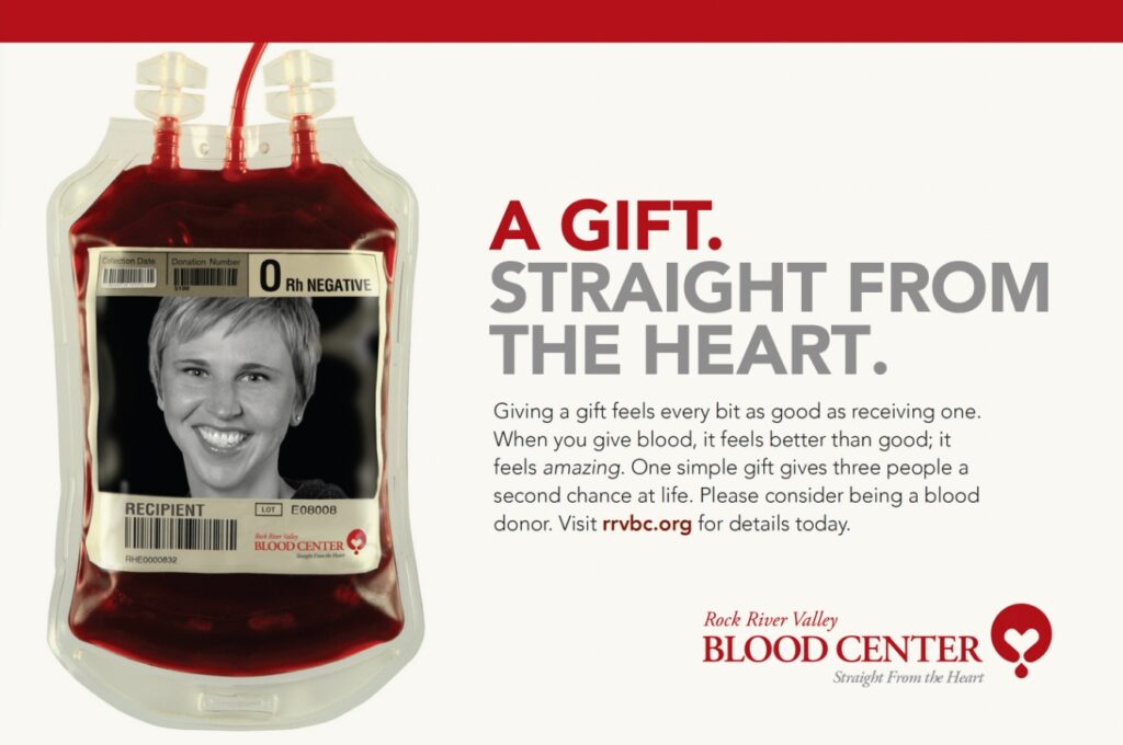
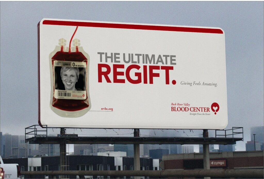
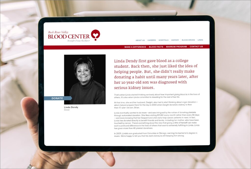
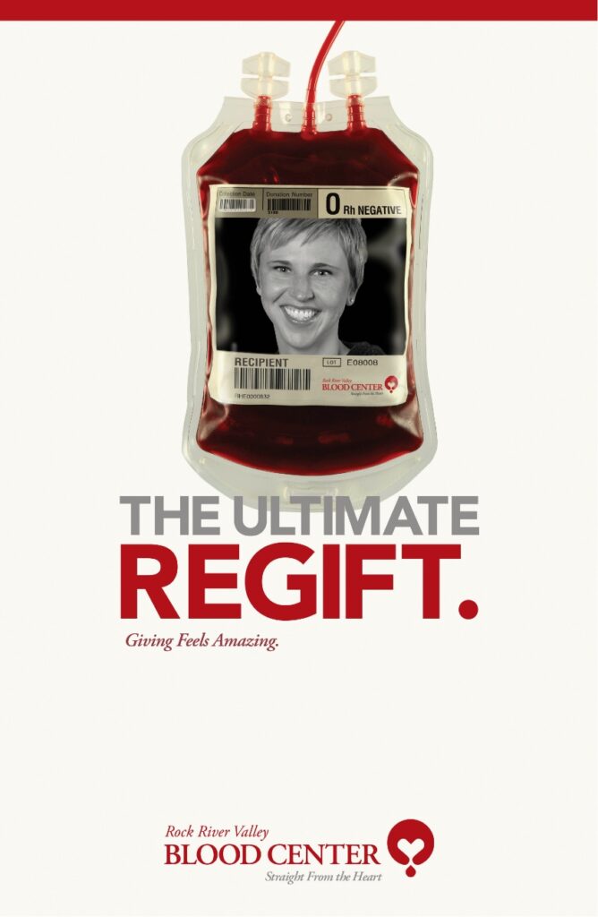
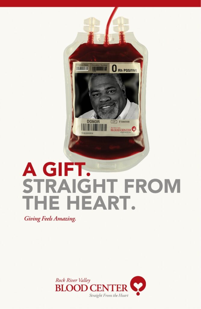
With its warmth and compassion, the new logo sought to convey RRVBC’s true purpose while evoking a sense of connection, empathy and love. Advertising with memorable headlines like “A GIFT. STRAIGHT FROM THE HEART,” and, “THE ULTIMATE REGIFT” drove traffic to a dynamic new website that gracefully told the stories of generous donors and grateful recipients. During the following year, donation rates and blood volume increased as existing donors strengthened their commitments and new donors began to step up.
If your organization is ready to create brand infrastructure capable of carrying meaning for decades, we would welcome a conversation.
"*" indicates required fields